The grain symbol
The four-blade mark redrawn as thousands of tiny dots, dense where the colour is bright and loose at the edges. It shimmers gently and turns slowly as you scroll.
Case study · Our own brand and website
You are looking at it. This is the story of the brand, the symbol, the design system and the build behind rixesstudio.com.
Back to the home page →Every studio tells clients what good looks like. So the first job was our own: build a brand and a website that show the standard we sell, and that a small senior team can keep growing without a heavy platform.
A small team, one standard.
Rixes Studio is a boutique digital studio in India. It builds websites, apps, WordPress sites, social media, ads, motion graphics, 3D renders and Three.js experiences, all under one roof.
The studio has no office. It works online, so there is no reception desk and no layers between you and the people doing the work. You brief us on WhatsApp or a call, the designers and developers read it, and the same people build it.
That shaped the brand. With no building to put on the website, the work and the way it feels had to carry everything: confident, warm, a little bold, and honest about what we do.
Four curved blades around an open centre.
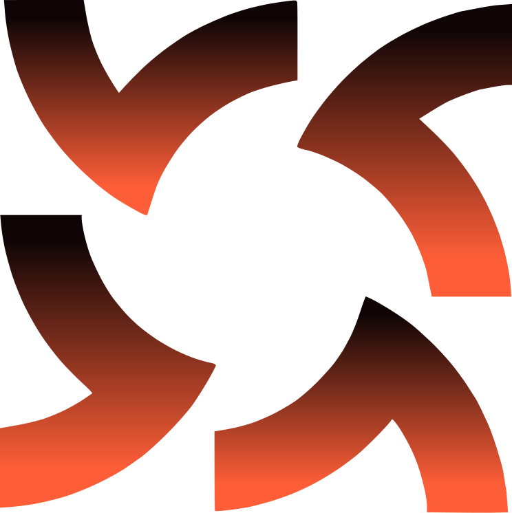
How we read the mark. The symbol sits between the two words of the name and works alone as the favicon, the loader and the big shape in the hero.
On the website the symbol is drawn two ways. In the logo it is solid, so it stays crisp at small sizes. In the hero it becomes fine grain: thousands of coral dots that are dense where the colour is bright and scatter at the edges, so the mark feels made, not pasted in.
Coral on warm black, on cream. Three colours do almost all the work.
The night the work comes out of. Text, dark panels, the footer. Close to black but warmer, so it never feels cold.
The energy. Taken from the logo and used for actions, highlights and the symbol. An accent, never a body colour.
The page. A soft warm white that gives the dark and the coral room to breathe.
A soft highlight for panels and the odd card, so a screen is not only black, white and orange.
A deeper coral for small text on light backgrounds. Plain coral on cream is only 2.7 to 1 contrast; this is 4.7 to 1.
The shadow side of the gradients, where coral fades down into the dark.
Contrast, measured: warm black on cream 17.7 to 1, cream on warm black 17.7 to 1, coral on warm black 6.6 to 1, warm black on coral 6.6 to 1. White on coral is only 3.1 to 1, so buttons use dark text on coral, never white.
One geometric sans, one italic serif, one mono.
Outfit matches the rounded geometry of the logo's wordmark. The serif adds the human voice: it appears once per heading, always in coral. The mono gives the studio a quiet technical edge.
The pieces that make the site feel like the studio.
The four-blade mark redrawn as thousands of tiny dots, dense where the colour is bright and loose at the edges. It shimmers gently and turns slowly as you scroll.
Black into coral, never a flat fill. The hero, the dark panels and the call-to-action all share one warm glow that moves with the pointer.
A rounded bar that slides away when you scroll down and returns when you scroll up, so it never gets in the way.
One italic serif word per heading, always in coral. It is the voice of the brand: human next to the geometric sans.
Words that fill in as you read, sharpen out of a blur, scramble on hover and rotate in the hero. Each effect has one job and stops when you ask the browser for less motion.
The symbol rebuilt from dots with scanner-style boxes and labels around it, a nod to how a brief gets studied before it is designed.
Projects in a drag-and-snap slider with parallax inside each card, so a visitor can browse work the way they flick through a phone.
The tools we use as an edge-faded strip of tiles, with a lit tile travelling along it.
A small floating assistant with fixed answers to common questions. When it does not know, it takes the visitor's details as a lead.
No framework, no database, no build step. Plain code that loads fast, a small pipeline that never loses an enquiry, and a design system that keeps every new page on brand.
The logo, the four-blade symbol and the coral and warm-black palette came before any layout. Everything on the site is derived from those three things.
Tokens for colour, type, spacing and radius, then components: buttons, cards, chips, sliders, forms. One page, design.html, documents all of it so any new page stays consistent.
Static HTML, CSS and JavaScript with no build step, so pages load fast on Indian 4G and anyone can edit them. GSAP and ScrollTrigger run the animation, Lenis the smooth scroll, and canvas draws the grain, halftone and particle effects.
The contact form posts to a small PHP file on the host, which hands each enquiry to a Google Apps Script. That adds a row to a Google Sheet, emails the studio, and sends the visitor a branded thank-you. If Google is unreachable, the host emails it instead and keeps a private backup.
Google Analytics 4 with a consent notice and lead events, a sitemap, structured data for services, FAQs and articles, a share image for every page, and a detail page for each of the 13 services.
The code lives in a private GitHub repository connected to the hosting, so a push updates the live site. The whole site is about 1.5 MB, with no database to maintain.
Four crafts, one small team. The people you brief are the people who do the work.
Brand identity, UI/UX in Figma, logos, social creatives and packaging, designed to match.
Websites, apps, WordPress and software, built by hand and tested on real phones.
Blender renders, packshots and animation, plus Three.js scenes that run in the browser.
Clear page copy, case studies, captions and posts, written in plain language.
Experienced designers, developers, 3D artists and content writers.
We are experienced designers, developers, 3D artists and content writers who build websites, apps, WordPress sites, social media, ads, motion graphics, 3D renders and Three.js work for startups, established businesses and agencies that need a white-label partner. 100+ websites and counting.
Small on purpose: you talk to the people who build it, scope and price are agreed in writing first, and we show progress every week.
Tell us about your project and we will tell you how we would approach it.